Authenticate
 Manage Users
 Customize
 Auth0 AI
 Platform
Form nodes
There are five types of form nodes: Start, Step, Flow, Router and Ending screen. These nodes have a very specific purpose for the structure of the form.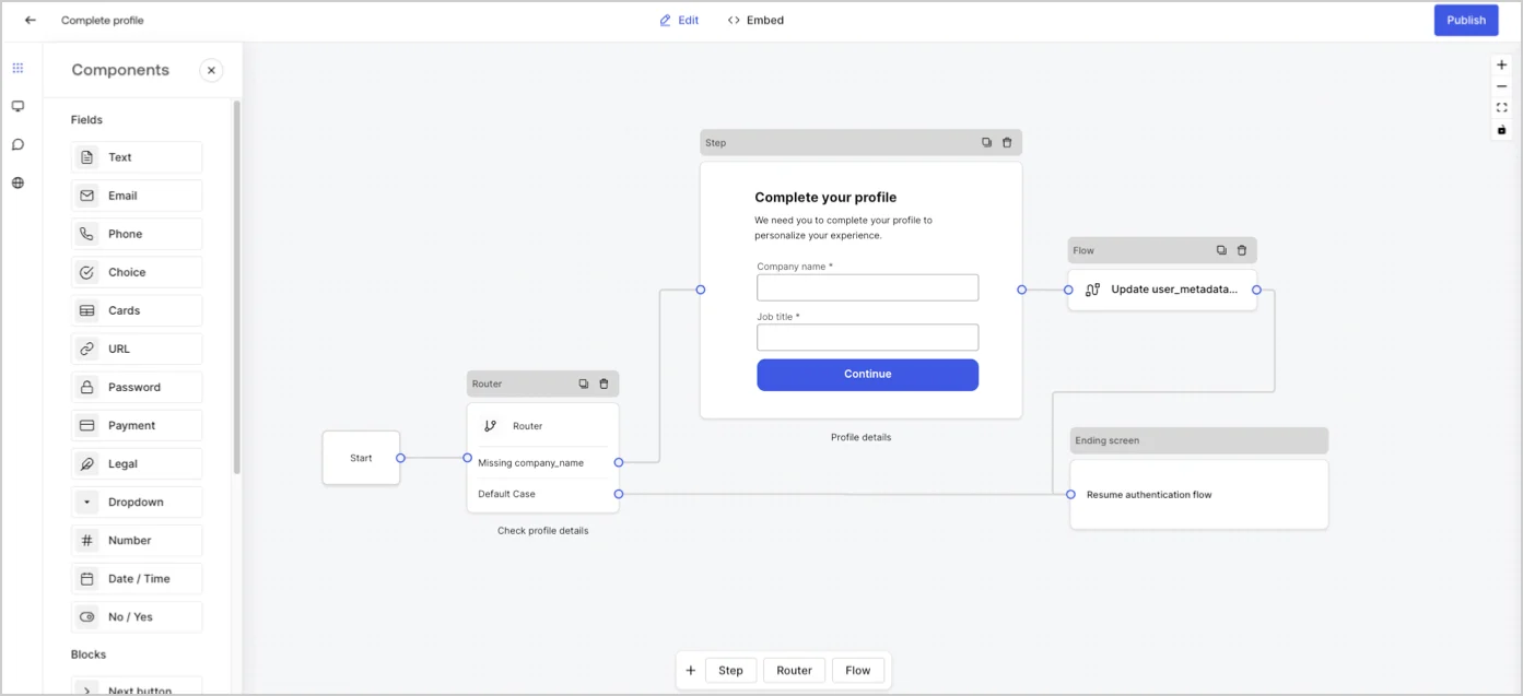
Step node
Step nodes are the visual representation of the form. They can contain any number of components, such as fields, blocks, and widgets where the user can fill in their data.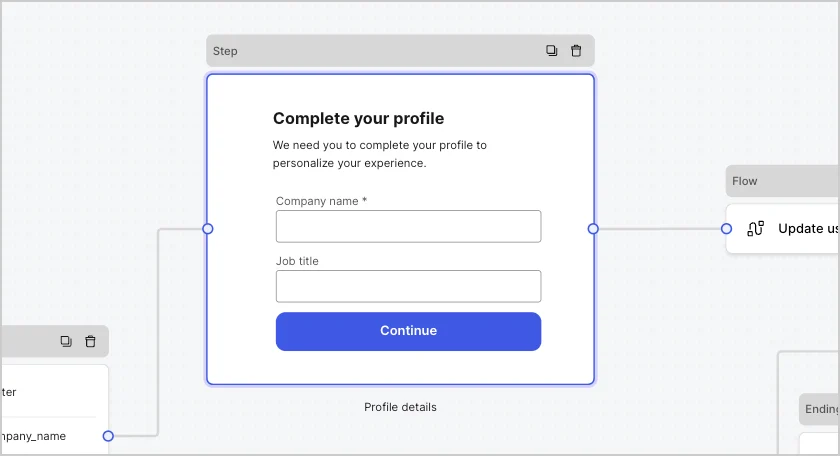
Field components
Fields are UI components where users input their information in Forms.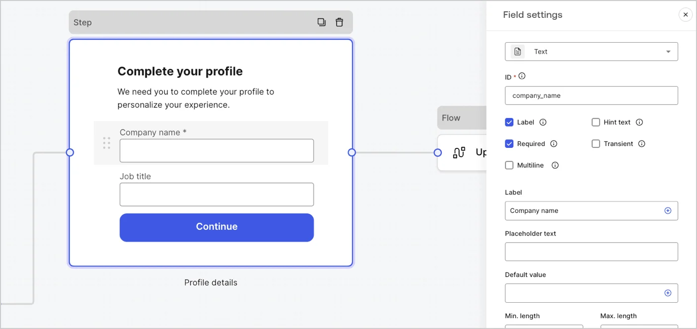
Field settings
Fields have a number of default settings that you can configure to meet your requirements. The default field settings are:Field validation rules
Available fields in Forms
The available fields with their specific settings and data output types are:Text field
Text field
Standard input lets a user enter any string value.
Text field settings
The text field setting is:Text field output value
The text field output value data type is astring.Email field
Email field
Standard input lets a user enter email string values.
Email field output value
The email field output value data type is astring.Phone field
Phone field
Standard input lets a user enter phone number values.The phone field output data type value as an
Phone field settings
The phone field settings are:Phone field output value
The phone field output value data type is either astring or, if Country picker is enabled, an object .The phone field output data type value as a string:object :Choice field
Choice field
Standard input that lets a user select single or multiple choice values.The choice field output data type value as an
Choice field settings
The Choice field settings are:Choice field output value
The choice field output value data type is either astring or, if multiple choice is enabled, as an array of strings .The choice field output data type value as a string:array of strings:Cards field
Cards field
Standard input that lets a user select single or multiple choice image values.The cards field output data type value as an
Cards field settings
The cards field settings are:Cards field output value
The cards field output value data type is either astring or, if multiple choice is enabled, as an array of strings.The cards field output data type value as a string:array of strings:URL field
URL field
Standard input lets a user enter a URL value.
URL field output value
The URL field output value data type is a string:Password field
Password field
Standard input that lets a user enter a password or a secret value.
Password field settings
The password field settings are:Password field output value
The password field output value data type is a maskedstring:Payment field
Payment field
Standard input that lets a user enter payment information using a payment provider. Payments are processed before the Ending node.The payment field output value data type for subscriptions as an The payment field output value data type for charge as an
Payment field settings
The payment field settings are:Payment field output value
The payment field output value data type is either a string or an object for after submission flows.The payment field output value data type as astring:object :object :Legal field
Legal field
Standard input that adds legal text and a check input.
Legal field output value
The legal field output value data type is aboolean.Dropdown field
Dropdown field
Standard input that lets a user select single or multiple dropdown choice values.The dropdown field output data type value as an
Dropdown field settings
The dropdown field settings are:Dropdown field output value
The dropdown field output value data type is either astring or, if multiple choice is enabled, as an array of strings .The dropdown field output data type value as a string:array of strings:Number field
Number field
Standard input that lets a user enter number values.
Number field output value
The number field output value data type is anumber.Date / Time field
Date / Time field
Standard input that lets a user enter either a date or time values.The date/time field output data type value for time is a
Date / Time field settings
The date/time field settings include:Date / Time field output value
The date/time field output data type value for date is astring:string:Boolean field
Boolean field
Standard input that lets a user enter true or false values.
Boolean field output value
The boolean field output value data type is a boolean.Custom field
Custom field
Standard field that you can customize to create your own field.
Custom field settings
The custom field setting are:To learn more, read Custom Field Components for Forms.
Blocks components
Blocks are UI components that add functionality to your forms but do not gather user information.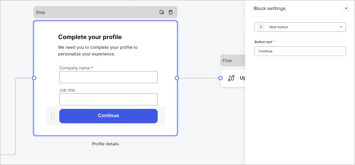
Available blocks in Forms
The available blocks are:Rich text block
Rich text block
A rich text block to personalize the step node with additional information.
Divider block
Divider block
A line to divide different sections of the step node. It can contain a small text.
HTML block
HTML block
A HTML block to create your custom UI.
Image block
Image block
An image block to personalize the step adding images.
Widgets components
Widgets are pre-built components, with third-party integrations, that add client-side and server-side logic to your forms.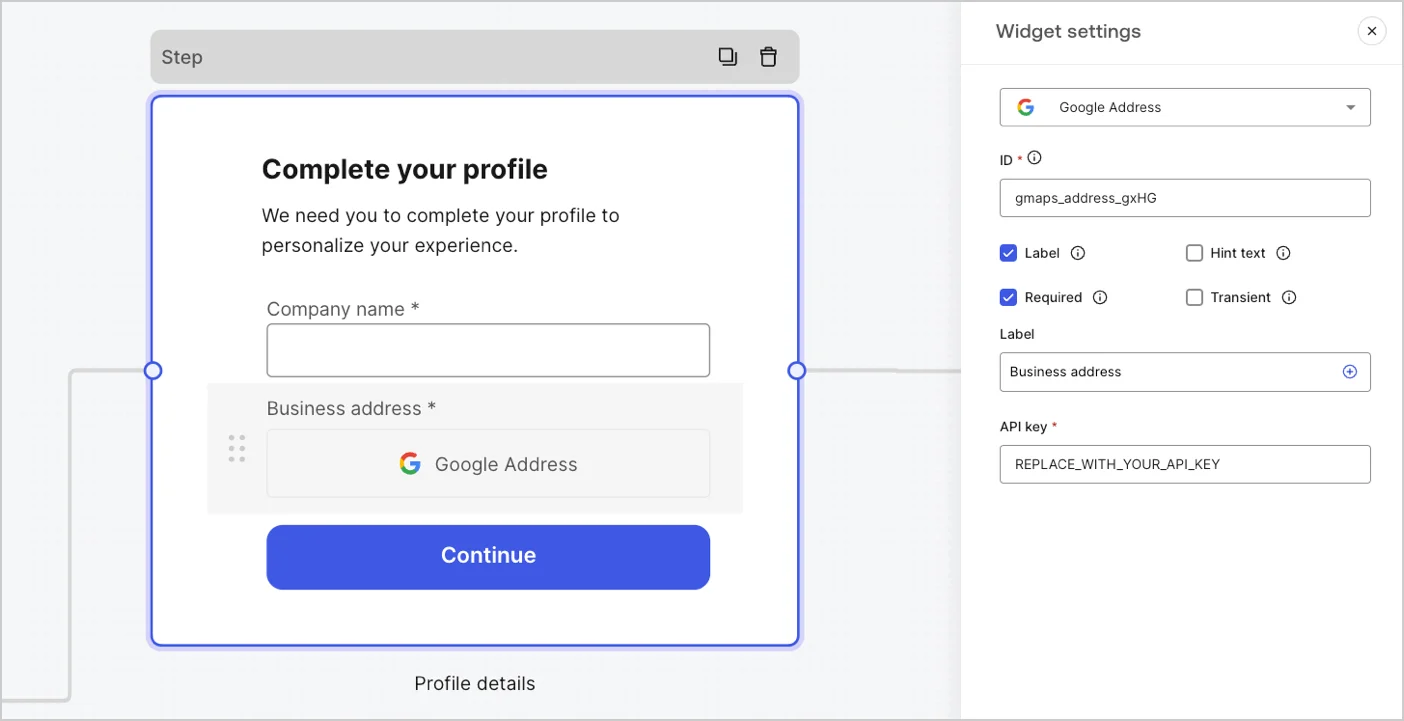
Available widgets in Forms
The available widget is:Google Address Widget
Google Address Widget
A widget that lets a user enter and validate their address.
Google Address widget settings
The Google Address widget settings include:Google Address widget output value
The Google Address widget output value data type is anobject.Google reCAPTCHA
Google reCAPTCHA
A widget that helps protect your website from spam and abuse by verifying that a user is a human and not a bot.The widget supports:Example of
- Score-based (v3)
-
Challenge (v2)
- Invisible reCAPTCHA badge
v2 and v3:v2requires user interaction with visible challenges, such as clicking a checkbox or solving puzzles.v3runs in the background and provides a score based on user behavior, without requiring user interaction. When using this version, make sure to implement additional business logic to handle the score and determine if further action is needed.
Google reCAPTCHA widget settings
The Google reCAPTCHA widget settings include:Google reCAPTCHA output value
The Google reCAPTCHA widget output value data type is anobject.Example of v2 response:v3 response:Verifiable Credentials
Verifiable Credentials
A widget that lets a user verify their identity using verifiable credentials stored in their digital wallet.
Verifiable Credentials widget settings
The Verifiable Credentials widget settings include:Verifiable Credentials output value
The Verifiable Credentials widget output value data type is anobject.Router node
Router nodes let you add rules to create conditional logic jumps between nodes. By default, a router node has a single pass-through rule named Default Case that connects to other nodes. You can add additional rules based on a set of conditions that a variable must meet to then connect to other nodes. To learn more, read Router.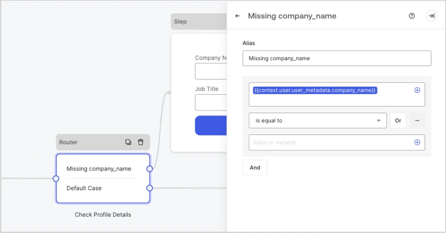
Flow node
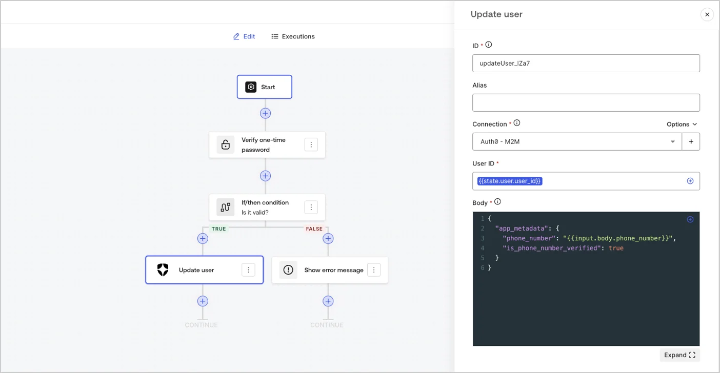
Flow nodes let you add and create custom logic and integration flows to your forms. To learn more, read Flows.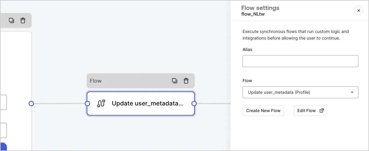
Start node
Start nodes are not visible to the user. It is where you can configure hidden field variables, such as user attributes when rendering a form with an Action.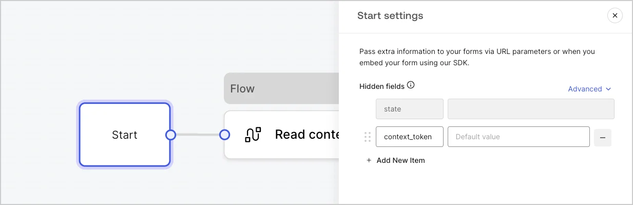
Ending screen node
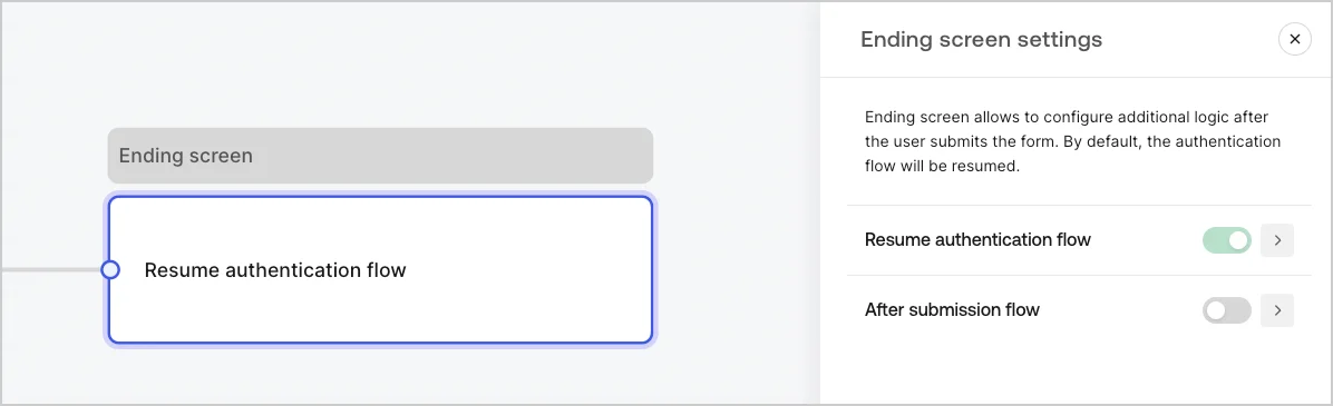
Every form has an Ending screen node. By default this node resumes the authentication flow and this is where you can configure an After submission flow.